
Home Is: Children's Book Illustration
- Alia

- Jun 27, 2020
- 2 min read
I decided to join the The Golden Pinwheel Young Illustrators Competition as it is an open brief competition focusing on children's books. With recent interest in illustration, I thought that this was a good opportunity for me to improve my skills. With TCK being on of my topics to study, I decided to focus on that for this project.
Research


Feeling disconnected is a common feeling amongst many individuals of all ages. Hence I took that as a prompt for my illustrations. I went to Instagram and put out an IG story - sticker question where I asked my TCK friends what they consider 'home'. It was important for me to ask other TCKs to understand their perception on home as everyone looks at things differently.
I received responses that ranged from comforting smells such as the ocean and drinks, family, love, peace and even pets. I then took the information collected and attempted to translate that into sketch. Originally my target audience were for young third culture children but after suggestions and consideration I opted to switch it to anyone who has felt this feeling of distance to their 'mother land' as it is fairly a common feeling whether the individual is a TCK or not.
Sketches
The concept of my illustration series is to represent the different perceptions of home. Instead of a normal children's book, I wanted to compile my illustrations into an accordion book. Where a continuous image can be found on the back side which adds a bit of visual interest to the book. I started off with a total of five illustrations but ended up having to add an additional page for the accordion work function they way I intended. The first five illustrations are inspired by the response I received earlier through Instagram. While added last minute, I think that the last page helps to conclude the book where it ends off open ended for the young readers to explore their curiosity.


Final Outcome


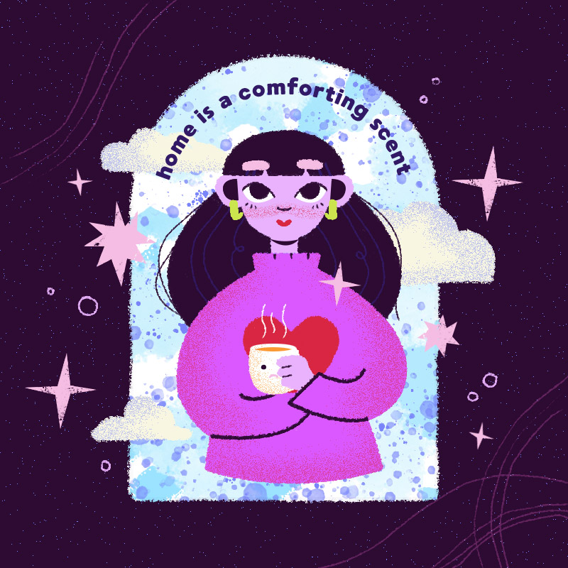


I chose a (mostly) cool tone colour scheme as I believe it represents the freedom of curiosity whilst a touch of a stronger colour like red and orange adds a sense of playfulness and contrast. Since accordion folds can be opened up, I thought it would be more interesting to create a continuous background that connects the front and back covers of the book. It wasn't intentional for the illustrations to give off a space/galaxy mood to it but I guess with the choice of colours, texture and sparkles, it comes off that way but I think that adds to the curiosity factor that is present in the story line.


due to the nature of the opposite side of the accordion being flipped, the blurb is the first image starting from the left.
Following my sketches, I had only 'planned' out how the front cover and one of the panels would look like. I then 'free handed' the rest of the panels making as they were all fairly similar to each other. The idea behind this continuous image is of an individual wondering around searching for the comfort of 'home' and finding her happiness.


mock up of how the book may look like when printed


Comments